
Hashve.co.il is an Israeli e-commerce platform for ordering flowers, gifts, fruit baskets, chocolates, and balloons. The platform aggregates hundreds of local stores nationwide, helping users find relevant delivery options by location.
Challenge
The main challenge was to design a platform that serves two distinct user groups: customers searching for gifts and sellers managing product offerings. The experience needed to support a large variety of products while remaining intuitive, fast, and easy to navigate. Balancing emotional appeal with efficient decision-making was critical to reducing friction in the gifting process.
Goal
The goal of the redesign was to create a platform that supports both customers searching for gifts and sellers managing their offerings, while maintaining a clear, efficient, and user-friendly experience.
Gifting Experience & UX Approach
The platform is designed to simplify the gifting process by combining emotional engagement with practical usability. The experience focuses on helping users quickly find suitable gifts while maintaining a pleasant and intuitive browsing flow. Clear navigation, structured categories, and visual hierarchy support efficient decision-making across a wide range of products.
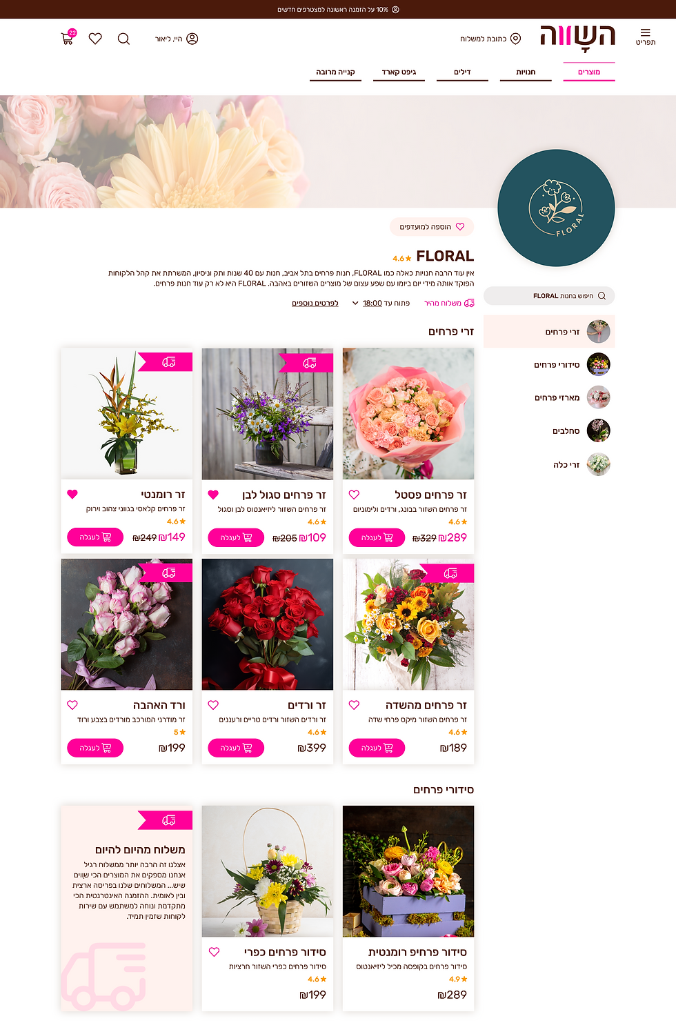
The homepage is designed to support fast product discovery while balancing promotional content, category-based navigation, and curated collections.

Quick Access Navigation
The header provides immediate access to key actions such as search, account, and navigation. This reduces friction and allows users to quickly enter the shopping flow from any point.
Promotional Entry Point
The hero banner highlights seasonal campaigns and directs users toward high-priority content, creating a clear and engaging entry point into the experience.
Category-Based Browsing
The category grid enables users to quickly navigate between gifting occasions and product types, helping reduce decision time and supporting efficient product discovery.
Value Proposition
Dedicated sections highlight unique selling points, such as supporting local businesses, reinforcing trust and emotional connection within the experience.

Occasion-Based Entry Points
The top section presents key gifting occasions, allowing users to quickly navigate based on intent rather than browsing the full catalog. This approach reduces decision complexity and supports faster entry into relevant product categories.
Product Carousel
The product carousel showcases selected items with key information such as price, rating, and quick actions. This layout supports fast comparison and encourages interaction through direct add-to-cart and wishlist functionality.
Seller Conversion Section
A dedicated section invites businesses to join the platform, creating a clear entry point for sellers. This supports marketplace growth by balancing the needs of both customers and vendors within the same experience.
The product page is designed to support confident decision-making and seamless purchase flow. It combines clear product presentation, flexible configuration options, and structured information to reduce uncertainty and guide users toward conversion.
.png)
Product Information & Purchase
The primary section focuses on product understanding and conversion. It includes visual presentation, key product details, configuration options, pricing, and primary actions. This layout supports quick evaluation and enables users to complete their purchase with minimal friction.
Recommended Products
A dedicated section presents complementary products and suggested add-ons. This supports cross-selling opportunities while maintaining relevance to the selected item, increasing overall order value without disrupting the user flow.
Additional Details
Secondary information is organized into tabs, allowing users to explore product details, specifications, and policies without overloading the main interface. This approach keeps the page clean while still providing access to deeper information when needed.
.png)
.png)
Cross-Device Experience
The platform is optimized for a seamless experience across devices. The layout adapts to different screen sizes, maintaining clear navigation, accessible interactions, and consistent usability on mobile and tablet.
The seller page is designed to present individual sellers while enabling efficient product browsing within their catalog. It combines brand identity, trust signals, and structured product listings to support both exploration and conversion.
Seller Identity
The top section highlights the seller’s brand, including name, rating, and background information. This builds trust and helps users understand who they are purchasing from within a multi-vendor environment.

Category Navigation
A side navigation allows users to browse products by category within the seller’s catalog. This reduces complexity and helps users quickly find relevant items without leaving the shop context.
Product Grid & Comparison
Products are displayed in a structured grid with key details such as price, rating, and quick actions. This layout supports easy comparison and encourages interaction through add-to-cart and wishlist features.
The page is designed to give users a clear overview of their orders, including status, payment details, and order history. It enables quick access to relevant information while supporting easy tracking and management of past and current orders.
.png)

Responsive Data Table
The table structure is fully responsive, adapting complex order data for mobile use. Information is reorganized into a clear, stacked layout to ensure readability and usability on smaller screens.
Structured Order Table
Orders are presented in a sortable table with key details such as date, status, total amount, and order number. This structure supports quick scanning, comparison, and efficient navigation across multiple orders.
Multi-Seller Order Handling
The system supports orders from multiple sellers within a single purchase, automatically dividing them into sub-orders. This enables a seamless marketplace experience while maintaining clarity in order tracking and management.
The multi-order flow is designed to support purchasing multiple products for different recipients within a single process. It guides users through a structured, step-by-step experience, reducing complexity while maintaining clarity across multiple deliveries.
Step 3. Product Selection per Delivery
Products are selected individually for each delivery using a focused view. This step isolates decision-making for each recipient, reducing cognitive load and improving accuracy.
Step 2. Delivery Assignment
Each product is assigned a delivery location through a structured selection process. This ensures accurate distribution of items across different recipients while maintaining a clear overview of the order.
Step 1. Quantity Selection
Users begin by selecting the number of products they want to purchase. This defines the structure of the order and prepares the system for multiple delivery configurations.
%20-%20step%201.png)
%20-%20step%201%20-%205%20selecte.png)
%20-%20step%203%20-%201%20delivery%20accordeon.png)
A dedicated mobile application was designed to support sellers and platform administrators in managing orders, communication, and operational workflows. The app centralizes real-time information, enabling efficient handling of incoming orders while providing advanced tools to resolve issues and maintain platform reliability.


Order Management (Seller View)
The seller order screen presents detailed information for each order, including order status, payment details, and customer data. It supports day-to-day operations by allowing sellers to track progress, review order details, and manage fulfillment in a clear and structured interface.
Operations Dashboard
The dashboard provides a centralized overview of all key activity, including incoming orders, delivery statuses, and daily performance metrics. It enables quick monitoring and immediate action, allowing sellers to manage their workflow efficiently from a single screen.
Admin Order Control Panel
This screen provides administrators with advanced control over orders, enabling direct intervention when issues arise. It includes a set of management actions, such as editing, canceling, contacting customers, and reviewing order history, enabling the platform to maintain service quality and resolve issues efficiently across multiple sellers.
Seller Order Actions Panel
This screen provides sellers with quick access to key order-related actions, enabling efficient day-to-day management. It includes options such as viewing order details, contacting customers, and handling delivery-related communication, allowing sellers to respond quickly and maintain a smooth fulfillment process.
The design system was created to support a scalable and consistent product experience across web and mobile platforms. It defines reusable UI components, typography, color styles, and interaction patterns tailored for multiple user roles, including customers, sellers, and administrators. Emphasis was placed on clear states, structured data presentation, and flexible components, enabling efficient development, easy maintenance, and seamless product growth.

This project demonstrates the design of a multi-vendor e-commerce platform that balances user experience with operational complexity. By addressing the needs of customers, sellers, and administrators, the solution introduces structured flows for multi-order purchasing, order management, and platform control. The design system and interaction patterns ensure consistency across web and mobile, supporting a scalable and maintainable product ecosystem.